

Text Sarah WETZLMAYR
Originally, automobiles were primarily technical artifacts where form followed function. Over time, however, the formal level increasingly moved into the foreground, and design became the central instrument through which brands make their identity visible. This changed not only the meaning and field of activity for automotive designers but also the influence that design philosophies exert on the strategic direction of major manufacturers. But what role does history play when it comes to further developing the identity of major brands? When must established frameworks and forms be broken? And how thin is the line between icon and dogma really? Many questions meet one irrefutable fact: It is still the front of a vehicle that tells the most about a brand’s identity. In short: the brand face.
What would a Porsche 911 be without its typical front? An intervention that the loyal community of the Stuttgart-based sports car manufacturer would almost certainly perceive as an absolute affront? A loss of face in both senses of the word? »Nothing is untouchable,« Porsche design chief Michael Mauer said a few months ago in a conversation with Chapter. But if everything is vulnerable, can a brand like Porsche — during major evolutionary leaps — still remain tangible in the same way? What is certain is that the design of a vehicle, especially the exterior design, contributes significantly to brand identity — presumably even making up the largest part of the DNA. Because even when performance or technical innovation are in the foreground, the associated factors will always be reflected in the design language. This means: When an automotive designer like Michael Mauer puts pen to paper, the result will most likely always be something that establishes identity. But what if the headlights he sketches with quick, practiced hand movements were suddenly no longer round but square? Even if the roofline still featured the sloping appearance typical of the Porsche 911, it could happen that the vehicle would no longer be immediately recognizable as exactly that when glancing in the rearview mirror. But that is precisely what it is about when a strong brand identity is to be created through certain design features.

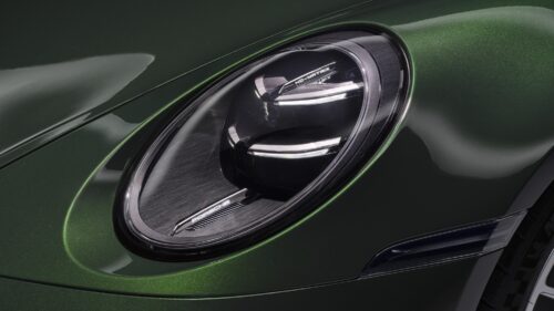
The round headlights are one of the defining design features that contribute to the unmistakable identity of the
Porsche 911 — as seen here on the Porsche 911 GT3 Touring.
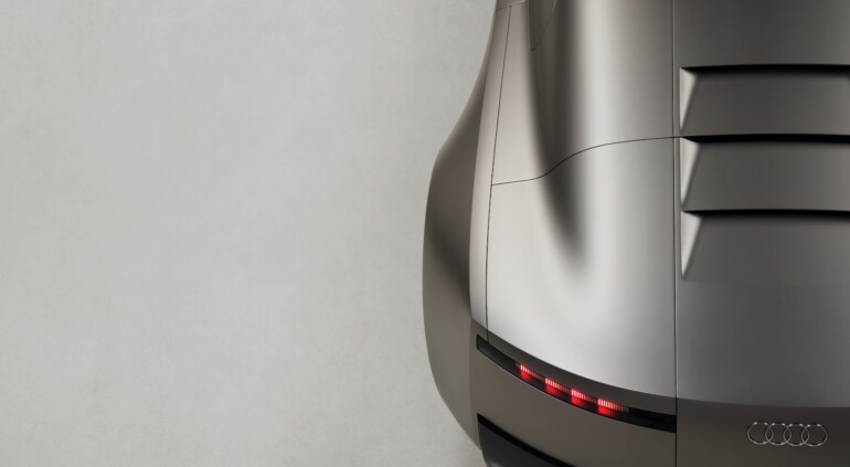
Chief Creative Officer Massimo Frascella is opening a completely new chapter at Audi. His design philosophy is based on the aspects of »clarity, technology, emotion, and intelligence.« The Audi Concept C was the first tangible manifestation of his concept.
The front of a vehicle plays the most elementary role, as design professor Sam Livingstone is also convinced. Brands like Porsche or BMW have understood that the front is the best place to position trademarks that are as simple as they are strong, says Livingstone, who, in addition to his work as a Visiting Professor at the Royal College of Art, also co-founded the agency »Car Design Research,« which operates at the interface between design, product, and brand. »The front fascia of the car — the shape of the grille and the headlamp or the combination thereof — is in many respects the face of the car. It is what you typically see most and think of most when you think of a vehicle,« he attests in an interview with Chapter.
ICON OR DOGMA?
When it comes to the front as an immediate recognition feature of a brand, the double kidney grille typical of BMW must also be mentioned. For over 90 years, almost every vehicle from the Bavarian manufacturer — whether a concept car or a production model — has been equipped with the two-part, rounded radiator grille. However, the BMW kidney grille did not always look the same but went through various evolutionary and developmental stages. For example, the narrow kidneys of the BMW 1500 heralded a turning point. For the first time, they were connected, slightly narrower than on all previous models, and placed between two horizontal grilles. With its arrangement of primary and secondary air grilles, this ensemble formed the blueprint for the front design of BMW core models until the 1980s.
With the front design of the all-electric BMW i3, which came onto the market in 2013, the original technical function of the BMW kidneys receded completely behind their aesthetic one. The decision was made to equip the flat, relatively wide double kidney with closed surfaces and blue accents to identify the vehicle not only as a BMW but also as an innovative electric car. With the two vehicles presented in 2019, the BMW X7 and the BMW 7 Series, the kidneys became significantly larger, more striking, and more present. The electric BMW i7, first introduced in 2022, is in no way inferior to those two models in terms of presence and conspicuousness, yet the double kidney had largely lost its original function as an open cooling air intake and now served primarily as a signature design element. On the i7, the shape of the kidney can even be further emphasized by an illuminated contour.
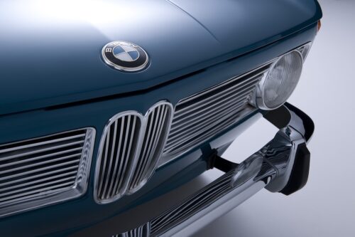
For over 90 years, almost every BMW — whether a concept car or a production model — has been recognizable by the brand-typical kidney grille. Those of the Neue Klasse model BMW 1500 (1961) were connected for the first time, even narrower than on all previous BMW models, and placed between two horizontal grilles.
With the Neue Klasse introduced in 2025, the most important design feature of the German manufacturer — alongside the Hofmeister kink — is now undergoing a reassessment. Previous vision vehicles already showed that the front will look slightly different in the future: more restrained, clearer, and — as the vertically aligned kidneys of the first Neue Klasse production model BMW iX3 presented in September of this year make clear — clearly referencing the brand’s history.
This corresponds to the German manufacturer’s fundamental stance of appearing somewhat more unobtrusive in design in the future. And in doing so, exposing the brand core in an even clearer way, as design chief Adrian van Hooydonk emphasizes. However, sticking to the form at a time when the function of the double kidney as a cooling opening has long since become obsolete also meets with criticism. As automotive designer and visionary creator Daniel Simon explains in an interview with Chapter, maintaining this form is an implicit prevention of radical new beginnings — an abstraction of the origin to the point of absurdity. »References are important. But it troubles me how much history we have to live with. The design library and the amount of unspoken requirements are already enormous,« says Simon. Mass manufacturers are inevitably committed to the past, and only a few manufacturers, such as the supercar manufacturer Koenigsegg, are exempt from this obligation, he adds. The design of major brands therefore always carries the baggage of the past with it.
So does it happen that dogmas are transfigured into iconic features and design elements that seem essential for the brand turn out to be baggage accumulated over the course of history? Is the front of the Porsche 911 not a well-rounded thing in both senses of the word, but a dogma disguised as an icon? Sam Livingstone waves it off and puts things into perspective: »Clearly, for any brand to lose everything that it stood for is essentially nonsensical, whilst to keep everything exactly the same is also nonsensical.« He shares the view that nothing should be untouchable with Michael Mauer. The question is to what extent changes take place. »The fundamental process of creating something new is to disturb something which is old,« says Livingstone, who has already worked with numerous brands when it came to finding out which design path they would like to take in the future.
For Sam Livingstone, the following insight is often missing in the discussion about automotive design: »That the semantic delivery of meaning through design is a massively important factor. But I think there’s another one which many people in the field fail to recognize, which is that it also performs a role to signify the brand.«
The automotive design strategist is convinced that design has the role of a signifier — that is, the design expression of a deeper meaning. Therefore, in the opinion of the expert and consultant, it would also be nonsensical to tinker with it too much. However, this does not mean that trademarks must be unchangeable and rigid — as if they were made of a material that cannot be deformed under any circumstances. Movement must be possible as long as the underlying level of meaning is not distorted, blurred, or shifted. Applied to BMW, this means: The two-part division of the radiator grille, deeply anchored in history, remains. Within this framework, which can be both expanded and reduced, Adrian van Hooydonk and his team have numerous creative possibilities to explore it sufficiently — without breaking it and risking the loss of the brand face.
BRITISH DESIGN ICONS
Marek Reichman, Chief Creative Officer at the British sports car manufacturer Aston Martin, has a similar perspective. In a conversation with Chapter, he emphasizes: »The design elements that are part of Aston Martin’s identity give my team a strong foundation on which to envision an exciting future. It informs our creative process but does not define it. We have tremendous freedom in what we do.« He identifies the elegant radiator grille as one of the most brand-defining design elements, which, as he points out, still fulfills the same function as at the beginning of the brand’s history — »to provide exceptional cooling performance.« However, the size and shape of the element, which is anything but aggressive, change slightly with each generation, Reichman notes. »The most significant change occurred in the post-Second World War era when company engineers intelligently combined three radiators into one connected system.«
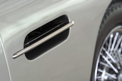
For Marek Reichman, Chief Creative Officer at the British sports car manufacturer Aston Martin, the Side Strake is considered one of the brand’s identity-establishing features. The element is particularly iconic on the legendary DB5: »That sports car is an exemplar of Aston Martin design beauty and simplicity. The Side Strake never fails to catch the eye on such an impressively fluid and clean form.«
As a second identity-establishing feature, the British-born designer mentions the Side Strake, which was designed in the early 1950s as a reinforcement strut made of lightweight aluminum in which an opening could be made large enough to meet the cooling requirements of the vehicles. Since then, there have been a number of brands that have tried to copy the Side Strake as a pure design element, the designer says. The element is particularly iconic on the legendary DB5, Reichman adds. »That sports car is an exemplar of Aston Martin design beauty and simplicity. The Side Strake never fails to catch the eye on such an impressively fluid and clean form.« For all design elements developed or further developed at Aston Martin, however, it is always about improving performance. In this context, the automotive designer mentions the two supercars Valkyrie and Valhalla. He does not find any of the brand-defining elements limiting. »I see the design elements carefully developed throughout the rich history of Aston Martin as the most tantalising ingredients imaginable, to include in the design ›recipes‹ of the new sports and luxury cars we create. They provide a framework of opportunities — far from being limitations. Together, they create recognition and my job is to evolve them. The historic DB5 and the all-new Valhalla are light years apart both literally and philosophically, yet the blend of fundamental Aston Martin design elements applied in the right way makes their lineage undeniable.« It is also undeniable that vehicles from the English luxury car manufacturer Rolls-Royce are recognizable at first glance as belonging to the brand. The most important identity component of all models manufactured in Goodwood is the Pantheon Grille, which with its vertical slats is reminiscent of the architecture of Greek temples. »Among the elements we consider unchangeable are also the Spirit of Ecstasy, which adorns every hood, and the Badge of Honour with the double ›R‹,« explains Domagoj Dukec, Director of Design at Rolls-Royce since 2024. Every vehicle is also defined by its proportions, he adds — the 2:1 ratio between wheel and body height has shaped the brand’s silhouette since the first Silver Ghost introduced in 1907. He also mentions the three most important lines — the waft line, the waistline, and the silhouette.
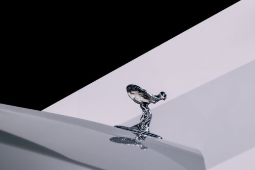
Indispensable identity components of the English luxury car manufacturer Rolls-Royce: The iconic »Spirit of Ecstasy,« which adorns every hood, and the Pantheon Grille, which with its vertical slats is reminiscent of the architecture of Greek temples.
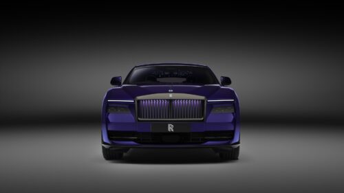
Black Badge is the subversive alter ego of Rolls-Royce introduced in 2016. »Black Badge stands for the bolder expression of our design philosophy. A contemporary reinterpretation that has not only become part of our identity but has also attracted a new, younger audience,« says Domagoj Dukec, Director of Design at Rolls-Royce since 2024.
While at Aston Martin much revolves around performance, at Rolls-Royce elegance and timelessness are at the center. »These are vehicles that stay in families for generations. That’s why it’s essential for us that they are still recognized as cars from Rolls-Royce decades later,« Domagoj Dukec notes in a conversation with Chapter. However, this does not mean that there is no room for reinterpretations. Dukec alludes to Black Badge — the brand’s subversive alter ego introduced in 2016. The central elements remain the same, but the dominant black color contributes to a different, somewhat bolder appearance. »It was an unexpected but convincing statement, and exactly this creative tension makes Black Badge so effective. Today, Black Badge stands for the bolder expression of our design philosophy. A contemporary reinterpretation that has not only become part of our identity but has also attracted a new, younger audience,« Dukec sums it up.
RADICAL NEW BEGINNING
The Ingolstadt-based car manufacturer Audi is currently opening a completely new chapter in terms of design. This also includes a new design philosophy which, according to Chief Creative Officer Massimo Frascella, is based on four aspects. »We have established four key principles, which are: clarity, technology, emotion, and intelligence. These elements must be present in every development step we take in design.« However, the brand credo »Vorsprung durch Technik,« known far beyond the borders of Germany, is not being discarded but integrated into the new design philosophy that Audi wants to span not only over the coming models but over the entire brand. »The Radical Next« was the claim with which Frascella introduced the new direction and the Audi Concept C, the first tangible manifestation of his philosophy. The concept vehicle is »a confident reinterpretation of the brand identity. The study shows a clear, sculptural presence, as if the vehicle were made from a single piece of metal — free from distractions, determined by tension and pure form.«
»I guess the radical next has a time frame on it. You can only be the radical next thing for a short while,« Sam Livingstone judges. He attaches significantly more importance to the four pillars that Massimo Frascella recently presented than to the short credo. Overall, it can also be observed that design philosophies are currently much more elaborate and profound than in the past decade, says Livingstone. If you rewind to the very beginning, cars were technical artifacts, he adds. The importance of form initially played hardly any role. »And then progressively the role of design was both made evident and recognized. And to some degree the importance of it has just continued,« the Briton sums it up and adds: »I think that J Mays, the Chief Creative Officer of Ford, was one of the first people with that title in the business.«
Mays left Ford in 2013. Since then, much has changed, not only at the American brand, when it comes to recognizing and using design philosophies as central brand-building blocks. »At the moment design philosophies are maturing beyond just some slightly pretty words to describe a sense of form language to ones which seem to connect to a wider purpose and also a bit more to the brand.«
It also fits that Chief Creative Officers, such as Massimo Frascella at Audi or Marek Reichman at Aston Martin, are responsible for much more than just the design of production vehicles or concept cars. They are not exclusively automotive designers but brand creators. This means that their field of activity is many times larger and more differentiated than was previously the case. Sam Livingstone sees a great opportunity in this: »For Massimo and for other Chief Creative Officers to be able to not just affect the styling and the appearance of the interior, but the entire behavior of the vehicle and the wider ways in which the brand is disseminated, is a really strong and important thing.« Porsche design chief Michael Mauer also appreciates the additional creative freedom. In an interview with Chapter, he notes: »Sometimes I wish for the old days back because we could concentrate much more on our core competencies then. On the other hand, I find it incredibly exciting that we designers are increasingly involved in the design of the entire brand image. As a result, the importance of design as a whole has also changed a lot. In leadership positions, you are suddenly part of the entire corporate direction.«
Of course, the round headlights of the Porsche 911, the double kidney at BMW, the Side Strake from Aston Martin, and the Pantheon Grille from Goodwood are not the only design features that have co-shaped the brand identity in such a decisive way. Many more could be listed, for example, the wedge shape of Lamborghini sports cars, which is spectacularly expressed in the Countach originally designed by Studio Bertone. »There are works of art that always remain contemporary, and the shape of the Countach is one of them. From the stylistic viewpoint, it is a perfect inspiration because even if we modify the rest, it takes form as an element of visual continuity between past and present. It is the summa of the DNA of all of Lamborghini’s design, the tradition of the stylistic language from the origins up until the present day,« says Lamborghini design chief Mitja Borkert about the iconic vehicle.
Incidentally, Sam Livingstone only uses the word »iconic« in exceptional cases. It is »heavily overused,« according to him. »I do wince slightly when I hear design directors or brands talk about something being iconic, when clearly iconic really is a judgement made over time by an audience, by the consumer, by the user, the customer and the market. You cannot legitimately tell people that something you have made is iconic. You might talk about the iconic kidney grilles of BMW or about the iconic grille of a Rolls-Royce. And maybe you talk about the iconic lights of a Porsche, but let’s be frank — the lights on the Porsche were exactly the same as the lights on every other car. It’s just that Porsche was unusual in not changing them very much.«
FIRST PUBLISHED IN CHAPTER №XIII »IDENTITY« — WINTER 2025/26