

Text by Andreas K. VETTER
The interaction between space, use, and perception shows how fragile identity can be. Spaces become projection surfaces upon which power relations, social dynamics, and cultural ideas are inscribed. Whether state representative buildings, artistic interventions, or pop-culture settings — spatial design shows that spaces ultimately carry no fixed meanings, but are mirrors of social interpretation.
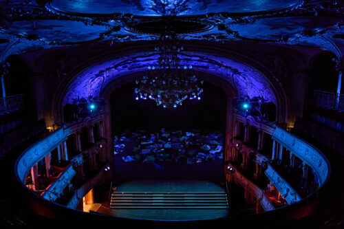
In September, Das Feuilleton published an article about the Zurich Opera House. It described how, immediately after the first concert of the new season and just after the established premiere audience had left the hall later that evening, a large number of teenagers and young people flocked in, having been spontaneously invited right in front of the building. They strolled in amazement — »with backpacks or beer bottles in hand« — through the rows of red upholstery, lay and crouched on or in front of the stage, let their gazes wander relaxedly through the magnificent scenery, and listened attentively or even with enjoyment to what was offered to them quite spontaneously: six string players had gathered chairs in the center of the stage and were playing Schönberg. And then it continued: singing was added, other instruments. The unconventional night audience stayed, listened, and applauded. Everyone involved enjoyed it — and rightly so. Presumably, however, one or two readers of that article might have started to wonder, because this image did not correspond at all to the operatic nature of the architecture. The spaces of such an institution generally belong to a corresponding, type-specific audience — at least according to the cliché: culturally experienced, educated, well-mannered, and able to purchase the usually expensive tickets. An image that has remained surprisingly consistent since the emergence of the great opera houses in the 19th century, even if today’s programs have long strived for openness and diversity. This makes the question all the more exciting: what happens when such a space, shaped by inscribed identity, tradition, and etiquette, suddenly meets an audience that does not fulfill these expectations?
The space itself does not change physically by a single centimeter, yet this scratches at its operatic nature. The question remains: does architecture as an object, as real estate, possess anything like identity at all? And how flexible or fixed is it, despite even the most unpretentiously ambitious and multi-generational program? After all, Edgar Degas already emphasized that such a house should fundamentally be met with skepticism: »In the opera, everything is false […] Only the effects that emanate from it are true.«
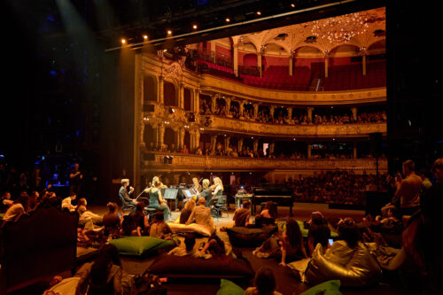
When the Zurich Opera House spontaneously opened its doors to a young night audience after the 2025 opening concert, the encounter between magnificent architecture and an atypical audience showed how fragile the identity of a tradition-rich space can be — and how free its impact.
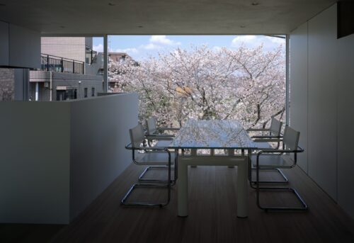
For us humans, identity is a very significant factor within our self-identification — and it provides orientation. In this respect, it is understandable that even our earliest ancestors went in search of their own self and personal localization. In the course of this cultural evolution, they discovered a special quality in their artifacts — their tools, clothes, or even huts. What they designed in the vast natural space solely for themselves as humans defined them; it became a tool for definition as an individual. We humans often merge in a veritable symbiosis with beloved or self-produced objects, with our homes or built spaces. Like Junichi Sampei‘s tower-like Cherry Blossom House in Tokyo, which gained its strange shape solely from the rapture of its owner. He desired to be able to look directly into the pink wonder from his living room at a height of seven meters during the few weeks of the cherry blossom magic, which is cultishly revered in Japan. That is why the building cantilevers as far as possible toward the tree.
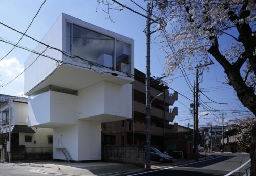
From early on, humans sought self-localization through their artifacts and spaces — objects with which they often entered into an almost symbiotic relationship. A poetic example of this is architect Junichi Sampei’s tower-like Cherry Blossom House in Tokyo, whose extreme form follows solely the wish to experience the short flowering period directly from a height of seven meters.
As rarely as such direct personal expressions appear in architecture — scenography, by contrast, is an ideal medium for the fact that spatial designs, with their meaning, become almost exclusively what they are. As an example, reference is made to a sequence from Billy Wilder’s sarcastic comedy »The Apartment«: the camera looks, accompanied by the pressing clatter of calculating machines, into an open-plan office with countless desks and people — certainly one of the most impressive visualizations of modern white-collar life in the big city. The questions »Where am I?« and »Who am I?« correlate in the architecture of mass society. The film’s protagonist, Jack Lemmon alias C.C. Baxter, pushes himself every morning with thousands of identically dressed people out of the New York subway, with hundreds of the total 31,259 employees into the entrance of the insurance skyscraper, and then with a dozen of them into one of the 16 elevators. Shortly thereafter, all these employees on their floor, the 19th, between 48 identical pillars, at two hundred identical desks under four hundred ceiling lights, process the ever-same. Perfected standard, merciless order, eternal repetition — that is how the job works, that is how the office interior is designed, and in this mode, the white-collar workers, nameless to their company, live. Even if Wilder intended this as a thoroughly critical but authentic reflection of reality around 1960, we naturally experience an exaggeration of that situation in the film’s genre. The set design suggestively enlarges the space to increase the effect. The central perspective sucks you toward the back, which the film set trickily achieved with increasingly lower furniture and small-statured extras, as well as mirrors at the end of the room. In any case, it was imaginatively whispered to the people in the cinema: conformity shapes identity. And from this bitter insight, C.C. Baxter would then work his way out in the course of the story — hopefully.
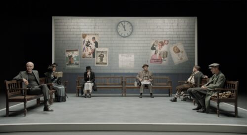
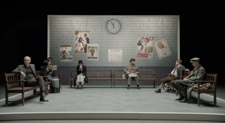
For the Museum of Bavarian History, the Stuttgart agency jangled nerves developed an immersive museum-didactic film curated by Christoph Süß, which uses a purist station waiting room and sophisticated projection to turn architecture into a narrative space. The production draws the audience atmospherically into the 1920s and transforms the minimalist setting into a historical space of experience.
In film, architecture thus becomes a carrier of our reflection on the state of mind — sometimes sentimental, sometimes humorous, sometimes dramatic — and in this medial function, it is an extremely suitable means of making us think. This insight was utilized by the Stuttgart agency jangled nerves when they developed a museum-didactic film for the Museum of Bavarian History — curated by Christoph Süß. This immersive opportunity to directly encounter the 1920s offered a wonderfully purist setting as a communication level: a station waiting room. Architecturally, there is only a platform on which the actors perform, as well as a back wall and a few pieces of furniture. Nevertheless, the production manages to pull us atmospherically into the respective time, into a third-class and a first-class waiting room — solely through sophisticated projection and the people within it. One succumbs to the suggestion, standing as if on the edge of the stage oneself, and willingly lets oneself be drawn into the historical scenes, even though the studio reality was perceptible in the background. Obviously, we love the seduction of stories, where cleverly animated spaces guide us immensely helpfully. The architecture shown becomes our space.
The most intense personal engagement with our identity is certainly experienced in childhood. In this process, not only family and fellow human beings have a strong influence, but also the spaces and houses in which we live. One of the most impressive reflections of this developmental period in personal maturity is the artistic work of Gregor Schneider, who became famous for conceptually reworking his no longer used parental home in Rheydt, Lower Rhine — which he calls Haus u r — since 1985. At the age of sixteen, his father had made the 19th-century townhouse available to him for studio work. And since that time, Schneider has been in a symbiosis with the building: it stands there, on the street, quite normal, with its stories and its architecture, while its owner constantly rethinks it on the inside and continuously remodels it accordingly. This creates a complex, dynamically changing nesting in which rooms, walls, stairs, and windows within the outer walls configure into a situation that only hints at normal use but does not allow it. Copies of the former rooms appear, as well as disturbing non-spaces, anti-uses, perversions of normal residential architecture.
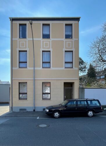
Since 1985, the artist Gregor Schneider has been transforming his parental home in Rheydt — the Haus u r — into a constantly changing architectural interior world in which rooms, walls, and paths merge into disturbing duplications and anti-spaces. In this obsessive engagement, the familiar parental home becomes at the same time a foreign body that repeatedly leads Schneider to the limits of his own identity and perception.
Anyone who has ever moved through one of his installations will never forget it — Schneider grabs you! Schneider himself sees it that way too: as early as 1998, he noted that everything had »taken on a life of its own.« »Because I spend most of my time here, I have to accept the rooms as they are, accept the most recently built room as an ordinary room.« The method of appropriation and engagement with what is, established as a teenager, created a probably unique connection with the structure. »As a sculptor, I am just as much at the mercy of my spaces as any visitor. The more I build on this Haus u r, the more unknown it becomes to me as well.« Although he is permanently in familiar surroundings, his almost obsessed preoccupation with it leads him into a desperate situation in which the parental home as such is increasingly lost. The coexistence with architecture does not seem to work particularly well for Gregor Schneider here.
In the work of Thomas Demand, a German artist colleague of Schneider’s of almost the same age, there is also a remarkable obsession with the engagement with spaces and their specific nature; he too pursues a strategy of transformation and representation, which, however, works in an emphatically indirect way. First, Demand usually photographs interior scenarios or living spaces, or uses press photos from, for example, real crime scene reports, which he then reconstructs in detail in the studio out of paper and cardboard. After completion, he photographs the models again — and only this photograph becomes the work of art on the museum wall. As an exhibition audience, however, we do not recognize at first glance that we are actually looking at a model. Inevitably, the famous question then arises to the artist: what is the point of all this effort? After all, a real architectural situation or a historical press photo already exists. A striking example is Demand’s »Oval Office Cycle,« from which the desk of then-US President George W. Bush graced the cover of the New York Times Magazine in November 2008. The artist creates — as Lars Blunck wrote — a kind of »fictional reality,« since ultimately everything we see is paper. In this transformation, a »picture about something« is created which, like a referent, is able to communicate certain aspects of the visualized to us. Unlike the usual reporting from the White House with people and actions around the president’s desk, this sterile-looking Demand space develops a surprisingly impersonal and statically state-like aura. Somehow routine, less powerful than usual.
But state architecture is actually supposed to be just that: powerful and thus also emotional. Ideally, it manages to make those represented by the institutions housed within it identify with the respective establishment. This requires symbols — like the flag next to the president’s desk, even if made of paper — and specific formal tactics. One of these public buildings of the highest formal significance in Germany is also one of the most conceptually exciting: the Berlin Federal Chancellery. Its architecture has mastered that delicate task set by the young reunified republic in the 1990s: the goal was to erect new state buildings in Berlin that promoted a democratic, open society and at the same time appeared with the typologically necessary monumentality without communicating obsolete messages or even dangerous authorities. While the court of honor with its flanking wings follows historical yet reservedly functional patterns, the central executive building with the main entrance takes over the show front. Although ten stories high, it shows only two levels, making all elements located there appear oversized. Symbolic »grandeur« results from architectural »size« — and this happens without having to resort to conventional symbolic vocabulary such as orders of columns, coats of arms, and eagles. Axel Schultes, the architect, wants to avoid the »stupidity of the facade« with his front designed in this way. The open, stage-set-like facade structure allows no immediate interpretation; it is not stylistically or iconologically readable like, for example, the imperial-era state architectures of the admittedly architecturally attractive Vienna Ringstraße. Here, in disparate Berlin, delusions of grandeur were driven out — despite the huge dimensions of the administrative system and the office building of the Federal Chancellery. New messages are required — sometimes clearer, sometimes more subtle. Here, civic duty stands above beauty, accessibility above hierarchy. So where and how is the Chancellor in this building? One could say: he is at work.
And now to the daring end of this little philosophical journey of thought — to two examples from Hollywood. Pointing out potentially recognizable formal-aesthetic parallels between Barbie’s Dream House and the Chancellery would be embarrassing — but it has now been done. Those who look closely will notice that beyond the comparable structural principles of a cubic skeleton construction in reinforced concrete, there is one decisive unique selling point for Barbie — the pink coloring. Decisive in that the Federal Republic existed even before the Schultes architecture, but Barbie’s World simply would not exist without that color. Of course, it only becomes truly tangible when children animate it through their imagination, which certainly also applies a little to entertainment-oriented adults. These have long been stuck in an easily accessible popular culture that — as Umberto Eco noted — »delivers the feelings it wants to trigger right along with it.« Director Greta Gerwig, in any case, was long an adult when she dealt with the figure and phenomenon of Barbie. Her successful film published in 2023 and its narrative play with this by providing the plastic-based doll world »Barbieland« with its own hermetic identity, in which everything is subject to an intrinsic logic — architecture, clothing, home accessories, and automobiles included. Through the actual breakout of Barbie and Ken into our human reality, to Los Angeles, the pink biotope becomes a factual secondary reality. Its plausibility finds support in the fact that when both realities merge in the fiction of the film, the action continues seamlessly in the authentic city of L.A. This brings us very close to Peter Weir’s complex reality in »The Truman Show.« Its plot takes place in a film set representing a small town, built as a TV backdrop in a hangar, which in the film forms the actual life of the main character Truman for decades. At the same time, this film set actually exists as the real seaside resort of Seaside in Florida. And this — created in the context of New Urbanism — was itself designed and built entirely in the spirit of a scenery. Its master plan strives to revive the values of traditional urban structures and forms lost in modernity. A projection perceived by the designers as legitimate and necessary, with the goal of allowing the people moving into the artificially created small-town paradise of Seaside to live more pleasantly, socially, and consciously. They should finally have the opportunity again to develop a feeling for the place in which they live and to identify with it emotionally. Whether such a form of life then really has to be pink in terms of construction or content, everyone can decide for themselves. As a summary, one could conclude to seek the positive, the diversity, and to engage consciously, openly and — speaking of opera! — perhaps even performatively with the so stimulatingly versatile aspects of identity and reality. One could creatively turn Adorno’s serious guiding principle around for this and simply claim: there is a right life in the wrong one!
FIRST PUBLISHED IN CHAPTER №XIII »IDENTITY« — WINTER 2025/26