Text by Thomas SCHWARTZ
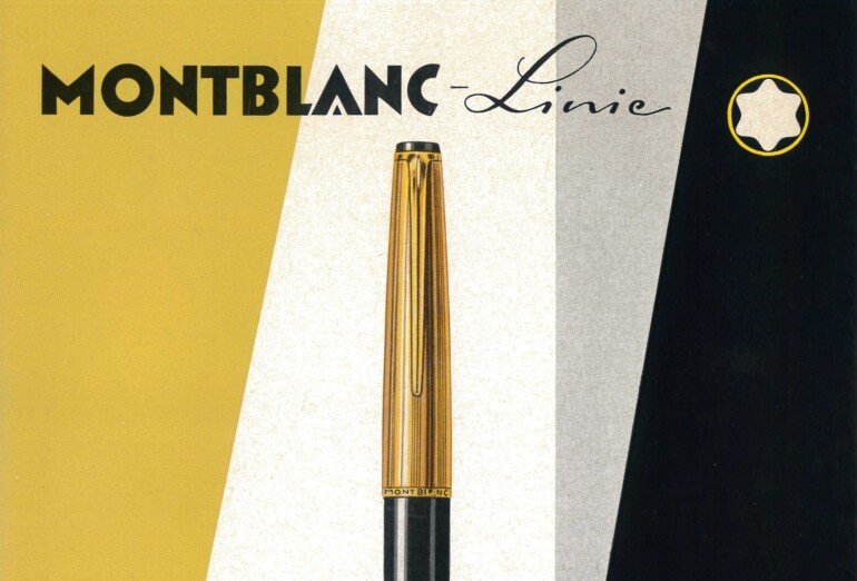
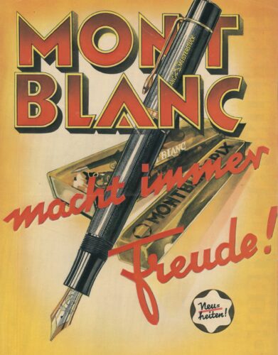
For over a century, Montblanc has cultivated a clearly defined brand image, closely associated with concepts such as artisanal precision, material quality, and reliability. The manufacturer, founded in Hamburg in 1906 as »Simplo Filler Pen Co. Max Koch«, focused from the outset on the production of high-quality writing instruments, with the fountain pen as its central product. The »Meisterstück« line, introduced in 1924, became particularly influential — to this day the epitome of the highest manufacturing standards and an uncompromising promise of quality. In our »Repro« section, we showcase historical Montblanc advertising motifs that visually articulated this claim early on.
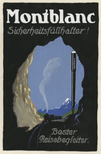
1910
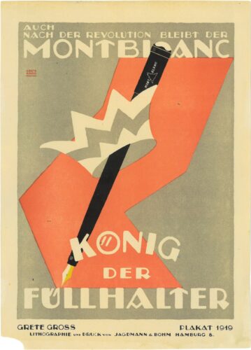
1919
To underscore this claim of the company, which today also offers watches, jewelry, and leather goods, among other things, Montblanc has always relied on the targeted use of symbolism and storytelling. This begins with the choice of brand name and logo: The reference to the highest mountain in the Alps is intended to symbolize the outstanding quality of the products, while the white star emblem refers to the six snow-capped peaks of the Alpine massif. Furthermore, the number 4810, a reminiscence of the officially measured altitude of Mont Blanc, is engraved on every Meisterstück nib. The company’s clear positioning also found expression in its advertising. Already in the early years of the 20th century, initial campaigns helped establish Montblanc as an internationally renowned manufacturer of exclusive writing instruments and as the symbol of cultivated writing culture. However, the writing instruments were not presented as classic luxury objects, but — figuratively and literally — as outstanding utilitarian objects, an attitude that Montblanc continues in its communication to this day.
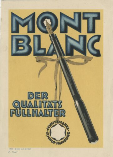
1925
1935
In the 1920s, the characteristic brand style was particularly shaped by the influential graphic designer Grete Gross, who, as head of the newly established advertising department, fundamentally shaped the brand’s entire visual identity. During her era, a holistic concept for Montblanc’s visual communication was created, which included advertisements, packaging, and store design, among other things. Her style was characterized primarily by stylized forms, dynamic layouts, and bold typography. The advertising motifs designed by Gross emphasized clarity and geometry, combining these with progressive visual ideas for the era: The writing instrument presented as the »King of Fountain Pens« with a crown or diagonally across the image, with a gold-colored ribbon as a »distinction bearer« (»The Quality Fountain Pen«).
1973
1990
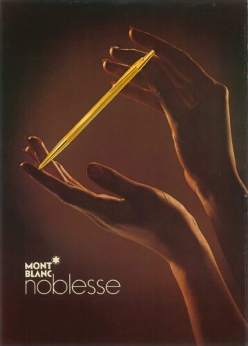
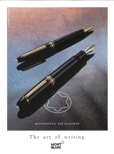
In the following decades, the visual language also moved between graphic intensification, functional representation, and occasionally striking typography — yet the tone remained restrained, at times almost documentary. Thus, advertising motifs from some eras, with their reduced design and focus on function, materiality, and artisanal quality, appear almost like non-fiction. For even as Montblanc increasingly established itself as one of the world’s leading luxury brands — the advertising messages formulated no overarching promises and rarely argued about social status. Instead, communication remains close to the product and the underlying highest quality standards to this day. One could attest: What endures needs no effusive narrative.
ARTICLE FIRST PUBLISHED IN CHAPTER №XII »SIMPLICITY« — SUMMER 2025

